
In our previous article, we replaced the default Joomla 4 template, Cassiopeia, with a more powerful template called Helix Ultimate. Unfortunately, this made our header image no longer visible. In this chapter, we will make the header visible again as well as review how to solve other problems created by the switch to the Helix template.
Step 1 Make the Header Module Visible Again
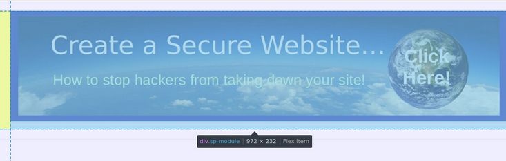
Click Content, Site Modules. Then click on the Header module to edit it. To see the module with the Cassiopeia template, we had placed the header module in the Banner module position. Change this to the Helix Logo Position. Then click Save and Close and View the Site:

Changing module positions solved the problem. Click on the featured Welcome article title to go from the Home page to the article page.

There are three social icons on the right between the article title and the article text. These are Facebook, Twitter and Linked In. Given that these mega monopolies engage in extreme censorship that violate our rights under the US Constitution, we should not promote any of them. However, Helix makes it hard to hide them. We have already turned off Enable Social Icons in the Template Edit Basic options. However, these offensive social icons still appear on every article page!
Step 2 Add a Second Browser to Clear the Browser Cache
We will use the Social Icons problem as an example of how to use CSS to get your web pages looking exactly the way you want.
When building a website, we first make changes in the back end (the Joomla Dashboard). We then view those changes in the front end (what our website visitors see). In order to view the changes on the front end, we not only need to click SAVE on the back end for the changes to be applied to our server, but we also need to clear the browser memory – also called the browser cache – on the front end and occasionally even on the back end.
Unfortunately, if we use the same browser on both the front end and the back end, when we clear the cache on the front end, Joomla will log us out of the back end of our website. This requires us to log back into the back end to make more changes.
To avoid being logged out of the back end of our website, and still be able to clear the browser cache on the front end, you should add a second browser to view the front end of your website. This will allow you to clear the cache on the front end browser to see the changes while not clearing the browser on your back end browser to avoid being logged out of the back end.
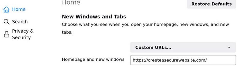
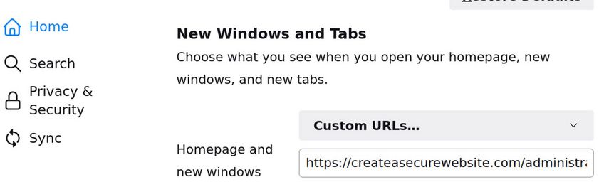
This is why I use the Firefox browser to make changes in the back end of my website – but I use the Libre Wolf browser to clear the cache and view the changes on the front end of my website. To make this process easier, I set the Home page for my Libre Wolf browser to be the front end of the Joomla website I am working on by going to Libre Wolf Preferences, clicking on Home, changing to Homepage to Custom URLS and copy pasting my website admin page URL .
I have also added a top menu to the Libre Wolf browser by clicking on Customize, then Toolbars and checking the Menu Bar. Here is the top of my Libre Wolf browser Start Page showing the top menu:
To clear the front end Libre Wolf browser cache, in the new top browser menu, click on History, Clear Recent History. Then set the Time Range to Everything. Then click OK. Then reload the page. Then see if the change you were trying to make actually occurred in the way you wanted.
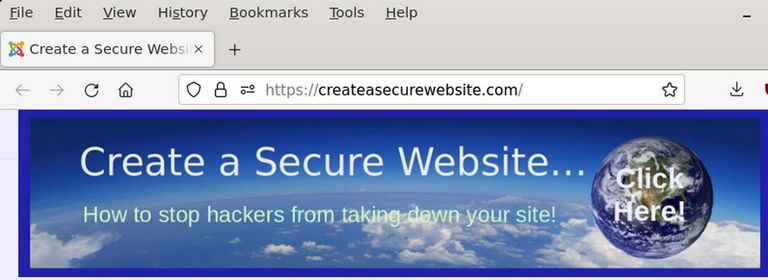
I also add the menu bar to the Firefox browser. But I only rarely use it to clear the cache. I then set the Joomla Administrator log in page for the website I am working on to be the start page for the Firefox browser:
Here is what the Firefox Start Page looks like:
This is my entire Desktop showing both browsers as an example of Side by Side editing:
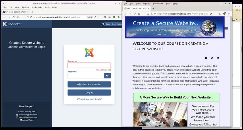
Note that each browser takes up less than half the desktop. On the far right side of the desktop is a Libre Writer document I use to take screen shots and record the changes I am making to the website and for copying CSS changes from the front end browser Inspector to the back end Template CSS box.
Step 3 Use the Front End Browser Inspector to Inspect the Social Icons
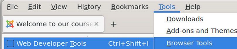
In the Libre Wolf Front End browser top menu, click Tools, Browser Tools, Web Developer Tools:
This will open a split screen with your website front end at the top of the browser and the HTML code in a lower left box and the CSS code in a lower right box. Below your website front end and above the HTML and CSS boxes is a menu with the Inspector icon on the far left side.
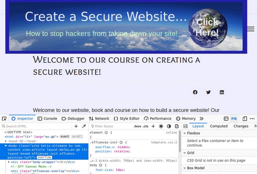
Click on the Inspector Icon which is to the left of the word Inspector. Then hover over the row or area containing the social icons.
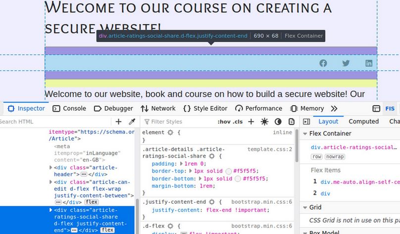
Then click on this row which will highlight the HTML for this row in the left box and bring up the CSS for this row in the middle box.
Copy the CSS class for this row into a Writer document:
.article-details .article-ratings-social-share
Step 4 Use CSS to Hide the Social Icons
Now that we know the CSS class for these social icons, there are a couple of ways to use CSS to try to hide this row. One way is to change the height of the row to 0. Unfortunately, this method does not work as a tool called Bootstrap changes the height of the icons based on the screen width and there are six screen widths.
The second method is to change the CSS display property to none. Sadly, this also does not work because bootstrap has added the word !important to the display property. Below I have added display: none to the CSS properties for this class. The line was crossed out. When I clicked on the filter icon, it revealed that a class called .d-flex was using display equals flex !important.
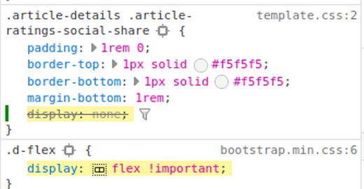
The only way to over to over-ride a property that is using the word important is to add the word important to our custom CSS like this:
.article-details .article-ratings-social-share {display: none !important;}
In the back end browser, click Template Styles, Helix Template Edit Custom Code, Custom CSS and copy paste the following:
.article-details .article-ratings-social-share {display: none !important;}
Then click Save. Then in the front end browser, click History, clear History, Everything, OK. Then reload the page.
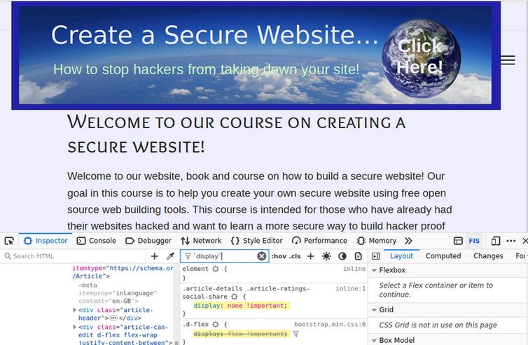
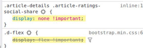
Now the social icons are gone. As a bonus the gap between our article title and the article text is also gone. Here is a closeup view of the CSS class showing that our custom CSS display none property is now over-riding the Bootstrap display flex property – but only for this particular class:
Delete Social Icons from the Mobile Menu
Sadly, if you narrow the browser to the Tablet or Mobile width, the social icons come back with the Mobile Menu. To hide social icons on the mobile menu, click Templates, Styles and click on the Helix template to edit it. Click Menus. In the Menu screen, scroll down to Off Canvas Menu and turn off Social Links, Login and Contact. Then click Save and close the Template Edit screen.
Second example of using CSS to fix the Helix template… Fix the header ghost margin
Hover the inspector over the header row and click on it:
There is a small ghost margin on the left side of the screen that is preventing our header from taking up the entire space.
Add the following CSS to the Helix Custom CSS box:
#sp-header .sp-module {margin-left: 0px;}
Then click Save. Then click Close. Then clear the Joomla cache. Then clear the browser cache. This is why we have added this code to the bottom of the Helix Custom CSS box. Then click Save. Then in the front end browser, clear the cache and reload the page. Now the ghost margin is gone and our header is full width and centered.
Third example of using CSS to fix the Helix template…
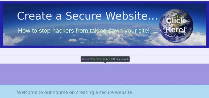
Reduce the margin between the header and the article:
There is still a huge gap between the header and the article title:

In the front end browser, use the inspector to highlight this gap:
Click on this to show the CSS properties for sp-main-body:
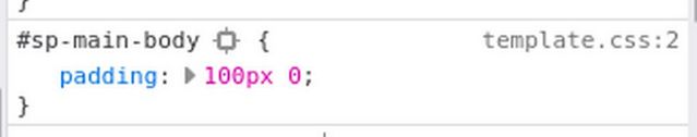
The main body padding vertical padding has been set for 100px. This is ridiculous. Add the following to the Helix Custom CSS box:
#sp-main-body {padding: 20px 0;}
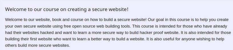
Click Save. Then clear the cache on the front end browser, reload the page and view the result:

There is still some space between our header and the article title. But this will be taken up when we add a menu below our header.
Fourth example of using CSS to fix the Helix template…
Reduce the width of the article column:
On wider screens, the article column is too wide. Studies have shown that reading is faster and comprehension greater if the number of words per column is about 14. Below there are more than 20 words per column. This is despite the fact that we have set the body layout to be a Boxed Layout.
What causes this is that Bootstrap sets the columns too wide on wide screens - and Helix does not offer us an easy way to make the boxed layout narrower. We will therefore have to use CSS to fix this problem. Add this to our Custom CSS box:
.layout-boxed .body-innerwrapper {max-width: 960px;}
Then clear the front end cache, reload the page and view the result:
This is still too wide. The box model shows that the actual width of the column is 870 pixels:
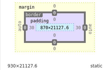
We have chosen a body width of 960 because it is divisible by 2, 3 and 4. So we can have 2, 3 or 4 columns. We do not want to reduce the body width any narrower than 960 pixels because we will need this width to place our Feature Box modules later in this course.
Thankfully, there is a class called .articleBody that we can use to make the article column narrower while leaving the body at 960 pixels. Add this to our Custom CSS box.
.articleBody {max-width: 880px; padding-left: 20px;}
And add this to the main body element CSS:
#sp-main-body {padding: 20px 60px; max-width: 920px;}

There are a few more lines we need to add to our Helix Custom CSS. Here is the complete list of 9 CSS changes:
.article-details .article-ratings-social-share {display: none !important;}
#sp-header .sp-module {margin-left: 0px;}
#sp-main-body {padding: 20px 60px; max-width: 920px;}
.layout-boxed .body-innerwrapper {max-width: 960px;}
.articleBody {max-width: 880px; padding-left: 20px;}
#sp-menu .sp-column {height: 30px;}
.sp-megamenu-parent > li > a, .sp-megamenu-parent > li > span {
line-height: 30px;}
.menu-with-offcanvas {display: none:}
.container-sm {padding-right: 0 !important; padding-left 0 !important;}
Move the Custom CSS Lines to a Custom CSS File
The Helix Custom CSS box is convenient. But right click on your Home page and click View Source. You will see that all of these CSS lines are added to the head of the HTML file. It is much better to add them to a template custom.css file. Note: While the default Joomla template insists on a file named user.css file, the Helix template insists on a file named custom.css. To create a custom.css file, go to Templates, Code and click on the Shaper_Helix template to edit it. Then click New File.
For File Name, type custom. For File Type, select css. Click on the css folder in the left column to select it.
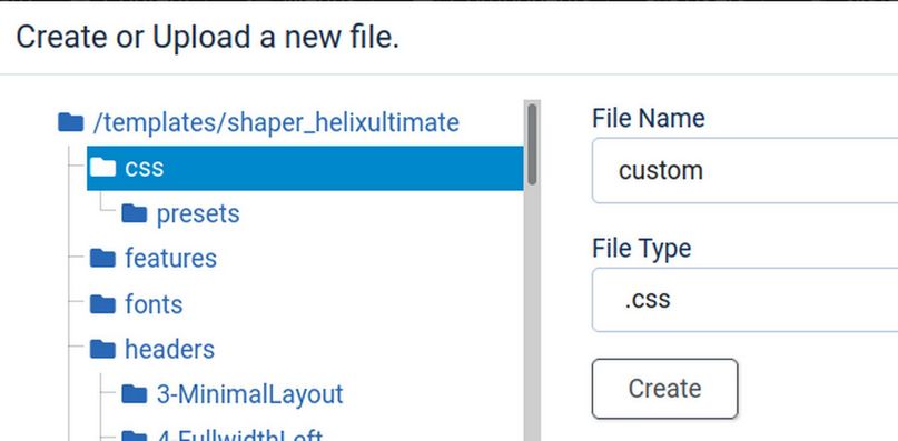
Then click Create. This will open up a custom.css file on Line 1. Copy paste the CSS from the Helix Custom Code box. Then Save and Close the file. Then delete the CSS from the Helix Code box and click Save. Then view the front end to verify the result is the same.
This completes our customization of the Helix template. If you would like to learn more about how to read and edit CSS, we have a complete course that will introduce you to both HTML and CSS. Here is the link: https://learnhtmlandcss.com/
What’s Next?
In the next article, we will review how to use our Helix template to add either a normal horizontal menu or a Mega Menu to our website.