
Joomla offers us the ability to use CSS styles to change the style of groups of modules with module classes. In fact, module classes are the main way that professional template designers control the appearance of modules in their templates. They create beautiful module classes and then have their customers type in these module class names to give their modules a distinctive appearance. In this article, we will create our own custom module class and then apply it to one or more of our custom modules.
Apply a simple background color class to a custom module
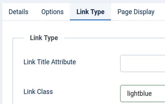
We have already seen how classes can be used to change the background color of a menu item. Recall that we placed classes such as .lightblue {background-color: #eeeeff; font-weight: bold;} in the Helix Template Custom CSS file. Then for any menu item we wanted to have a light blue background, we simply typed in lightblue (without the leading dot) in the menu item Link Class box.
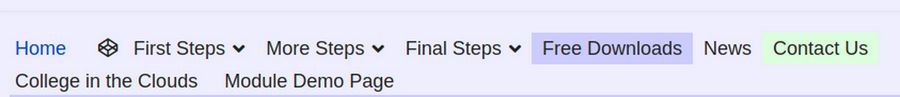
We can use this style on as many menu items as we want and on as many menus as we want. Here is what this light blue class looks like on the front end Main Menu:
The reason the bold part does not appear is because our custom.css is being over-ridden by the Helix Typography Internal CSS. Right click on the Page Source to see this:
<style>.sp-megamenu-parent > li > a, .sp-megamenu-parent > li > span, .sp-megamenu-parent .sp-dropdown li.sp-menu-item > a{font-family: 'Arimo', sans-serif; font-size: 18px; font-weight: 400; text-decoration: none;}</style>
To allow us to control the appearance of individual menu items, we should first go to Templates, Styles, Helix, Typography and turn off the Helix Navigation typography. Unfortunately, this makes our font size for all of our menu items very small:

So we can and should add the following to our custom.css file:
.sp-megamenu-parent > li > a, .sp-megamenu-parent > li > span, .sp-megamenu-parent .sp-dropdown li.sp-menu-item > a{font-family: 'Arimo', sans-serif; font-size: 18px; text-decoration: none;}</style>
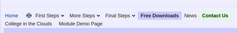
Now we have a readable font size and can control the font weight and background colors of specific menu items:
Creating and using module classes works the same way. In fact, we can use the .lightgreen class we created for our menu items to set the background for our modules!
Create three more custom modules
Go to Content, Site Modules and create three duplicates of our third Custom Module. Open each and rename them as Module 4, 5 and 6. Assign them to Top2a, Top2b and Top2c.
Select Module 4 to edit it. Then click on the Advanced tab. The second box is called Module Class. Here we will type in first a blank space. Then type lightblue:
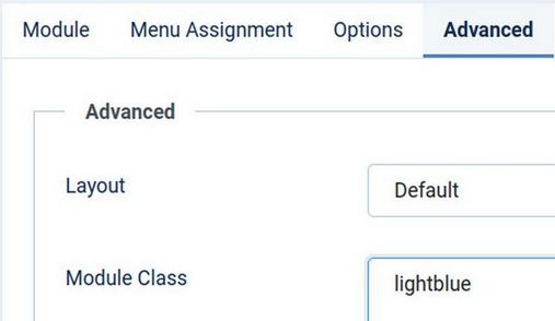
Then click Save and Close and View Site.

Create a More Complete Module Class Preset
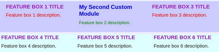
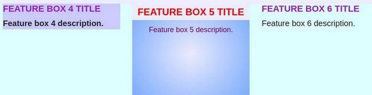
Let’s create a new module class called .my-module We can style all h3 elements with the class of my-module by adding .my-module h3 {property: value;} in our Helix template custom CSS and do the same for all p elements. This way, we can give different styles to our h3 heading element versus our p paragraph element. Here is the CSS for our new my-module class. Note that there are three parts, one class for the entire module, a second part for just the module h3 element and a third part for just the module p element.
.my-module {font-family: arimo, sans-serif; margin: 0; display: block; text-align: center; min-height: 250px; background-color: #eeffee;}
.my-module h3 { text-align: center; font-size: 22px; color: #ff0000; font-weight: bold; line-height: 1.3; padding: 10px; background-color: #eeeeff;}
.my-module p { text-align: center; color: #770077; font-size: 18px; font-weight: normal; line-height: 1.2; padding: 5px;}
The above is very similar to the Inline CSS we used in our earlier examples.
There is now some CSS Style for the entire module and some CSS for just the title (h3 tag) and some CSS for just the description (p tag). In the back end, go to Templates, Code and click on the Custom CSS file to edit it. Then copy and paste the above module classes into the end of our Helix custom CSS file. Then click Save and Close.
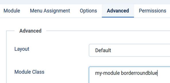
Now that we have a module class to work with, go to Content, Modules and click on our fifth custom module to edit it. Click on the Advanced tab. Add the following to the module class box:
(space) my-module
Then click Save and Close and view the site.
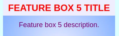
It is much easier to make dozens of modules with Module Classes than to make dozens of modules with Inline CSS. Plus we can control the appearance better. As just one example, we were able to add a minimum height property for our Module Class which will give our modules a more consistent appearance. Still, our fifth Custom Module has a rather plain looking background. We will next explain how to quickly and easily change the background to a more attention getting background using a Gradient Background Module Class.
Create Gradient Background Module Classes
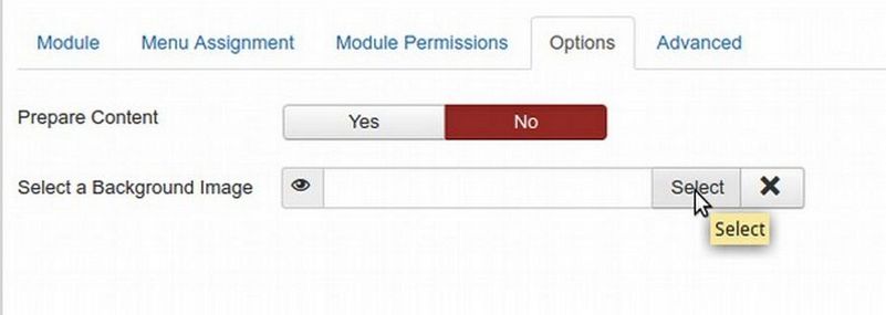
We could provide a background image for any module by loading the image to the images folder in our media manager and then linking to the image at the Options tab of our Custom Module.
Alternately, we could place background images in the images folder of our template and then link to them by creating a class. Either way, we would have to make the image and optimize it and scale it. Thankfully, there is a much easier way to create gradient background images with CSS module classes. Once we have our gradient module classes, we first copy and paste them into our Helix template custom CSS file. Then type this new class into the module style box on the Advanced tab of our custom module.
As an example of how this is done, let’s create a gradient module background style. A gradient is a transition between two colors in the background. We will start with a medium blue at the bottom leading to a lighter blue at the top. But you can change these to any two colors you would like. It is best to use an online gradient generator to help you determine the right CSS for the background gradient you would like. Here is a link to one of the easiest gradient generators: http://www.cssportal.com/css-gradient-generator/
Go to this web page. Then Click on either the Linear or the Radial Style. Then enter the two colors you want. We used Radial with #EEEEFF to Start and #77aaFF to End.
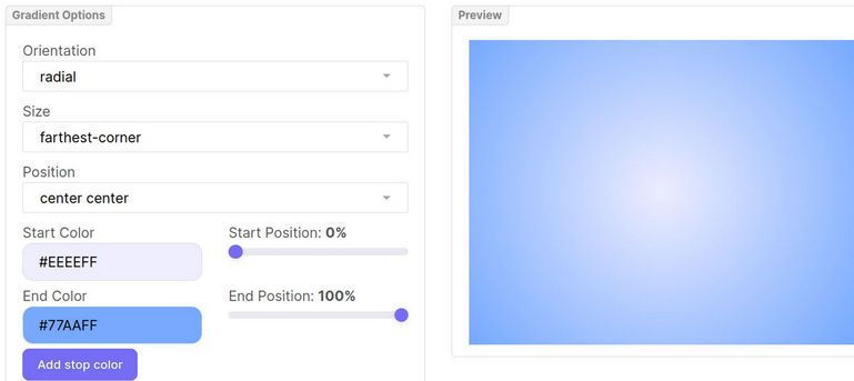
Then replace the CSS for the my-module class background color with the following gradient:
background: #eeeeFF;
background: radial-gradient(circle farthest-corner at center center, #eeeeFF 0%, #77AAFF 100%)
Click Save and Close and view the Module Demo Page:
Our custom modules are gradually starting to look more professional! We can use the above gradient generator to create 10 radial gradient background colors and 10 linear gradient background colors to use as Preset styles in our Rainbow template.
Add a Module Border
Our final example of the power of Module Classes will be to add a Module Class to provide a border around our custom module. We will add the following Module Border class to the end of our Helix template Custom CSS file.
.borderroundblue {
border-style: solid;
border-width: 3px;
border-color: #333399;
border-radius: 12px;}
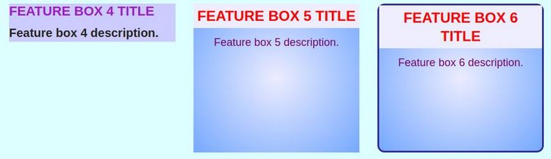
Once you have added this in your custom CSS file, it is very easy to change its value to whatever you want. Our main purpose is simply to create it so we have something to work with. Next, click on the Advanced tab of our sixth module and add our new Module Border class called borderroundblue to the box. Here is what the Module Class suffix box looks like for our third custom module.
Now click Save and Close. Refresh the front end browser:
Another benefit of using a module class is that if we wanted to change something, such as making the description font darker, all we need to do is change it in the template Custom CSS file and it would automatically change in any modules that used the my-module class. The benefit of dividing the border class from the module class is that you can apply any color of border and any color of background to any module. But the drawback is that it is still a lot of work.
Add an Image and a Link to our Demo Modules
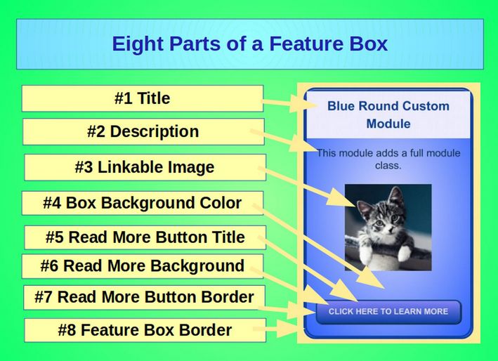
We will next add an image and a link to our practice modules. We will then place the border styling and the background styling and the link styling inside of the module class. This way, we can completely style any module just by adding the module class to the Module Class Suffix box in the Module Advanced tab. Up until now, we have focused on styling just our Module Title and Description. Earlier we said there were 4 parts to Module Styling. These are the Module Class, title “h3” styling, description “p” styling and link a styling.
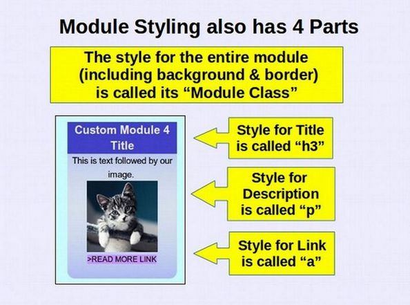
In reality, a custom module has 8 parts:
How to Add a READ MORE button to our Joomla Modules
Thus far, we have simply styled the h3 and p elements. Before we put all of the styles together, we will review how to create CSS for our link elements. Links are styled using the “a” and “a hover” tags. Links are also called buttons. Joomla has a one click tool for adding a READ MORE link to any Joomla article. But it does not offer this tool to add a READ MORE link to a Joomla module. The reason there is not a READ MORE button function in a Joomla Module Edit screen is because the module would not know what to link the Module to. Thankfully, we can use the link function in the JCE editor to not only define where the reader is to be directed when they click on the READ MORE button but also to define what the READ MORE button looks like and have it related to the style of the rest of our module.
Create three more custom modules
Make 3 duplicates of Feature Box 6. Rename them as Modules 7 8 and 9. Assign them to module positions top3a, top3b and top3c. Then open Module 7 and manually type the words READ MORE below the description. Select this READ MORE text. Then click on the LINK button in the JCE editor to open it. Then select any existing menu item or article as a link. Then click INSERT. The text for this new link will now turn blue.
Here is what the workspace screen looks like:
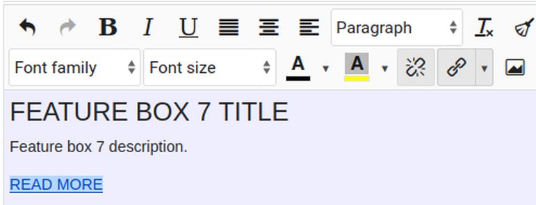
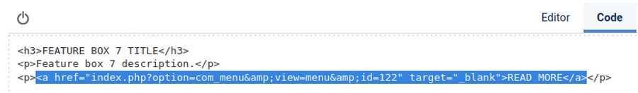
Then click on the Code tab and note that the JCE editor has created an “a” tag for our READ MORE Text:
We can style this “a” tag just like we styled the h3 tag and the p tag. For example, we could add the following to our Custom CSS file:
.my-module a { background-color: #333399; border-radius: 20px; color: #ddddff; text-align: center; font-size: 14px; font-weight: bold; line-height: 1.3; padding: 10px; display: inline-block; vertical-align: middle;}
Because we have already added our my-module class to our third module, there is no need to add anything more to the module. Just refresh your browser and this is what our seventh module looks like:
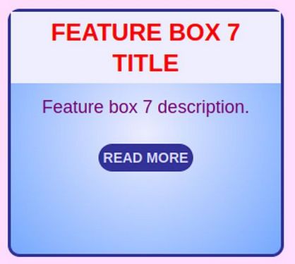
The border radius property is what creates the rounded border on our button.
Add real titles descriptions images and links
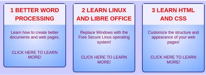
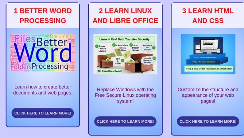
Our eventual goal is to add three Feature Boxes to our College in the Clouds dot org website to promote our first three courses. Go to Content, Modules to edit modules 7, 8 and 9. Here are the real titles and descriptions for our 3 feature boxes:
1 BETTER WORD PROCESSING
Learn how to create better documents and web pages
CLICK HERE TO LEARN MORE!
2 LEARN LINUX AND LIBRE OFFICE
Replace Windows with the Free Secure Linux operating system!
CLICK HERE TO LEARN MORE!
3 LEARN HTML AND CSS
Customize the structure and appearance of your web pages!
CLICK HERE TO LEARN MORE!
Here is what replacing the example text with the real text looks like in the back end:
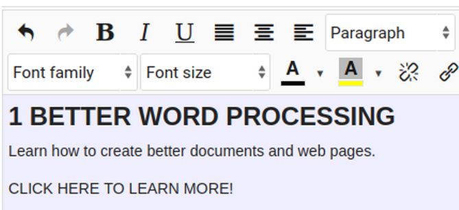
Note that we simply select the title and assign it to Heading 3. But we do not set the font size as we want to control that with our custom.css file rather that with Inline CSS from the JCE editor. Also change the name of the module to match the title in the workspace. Then click Save and Close and repeat to get real titles and descriptions in Module 2 and 3. Also set the first two modules to have the same module class as the third module. Then view our module demo page:
Add Links to the READ MORE Text
Edit each module again and add links to the LEARN MORE text
Here are the links to our three courses:
https://betterwordprocessing.com/
https://learnlinuxandlibreoffice.org/
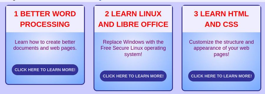
Add an Image to each Feature Box
Here are the three images we will place in the feature boxes:
Course 1 Better Word Processing

Course 2 Learn Linux and LibreOffice

Course 3 Learn HTML and CSS

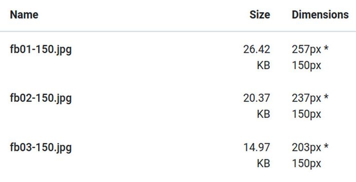
Place these images in a Writer Document. Then right click on each image and compress it to 150 DPI. Then save each image as fb01, fb02 and fb03. Then open each image with Gthumb and edit each image so that all three have the same height which we will set for 150 pixels. Name these revised images fb01-150.jpeg, fb02-150.jpeg and fb03-150,jpeg.
Then go to Content Media and create a folder called feature-box-images. Then open it and load the three 150 images to this folder.
Then go to Content Modules and open the first custom module. Place the cursor at the beginning of the description and press Enter to create a new line. Then place the cursor at the new line and click on the Images icon to select the first image. Click Save and Close. Repeat for the other two modules. Then view the result:
Create links to each Feature Box image
Go back to Content Modules and click on the first module again. Select the image and click on the JCE editor LINK icon. Copy paste the first link and then click Insert. Then save and close the module.
https://betterwordprocessing.com/
Repeat with the second and third module to add these links to their images:
https://learnlinuxandlibreoffice.org/
Then view the result in the front end demo page and click on the links to make sure they all work.
What’s Next?
It gets pretty boring having all of the modules using the same Custom CSS Preset. In the next article, we will review how we made the Rainbow Module CSS Presets. You can then either copy our Presets or create your own! We will also review how to get all of the modules to have the same height.