
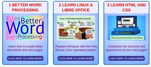
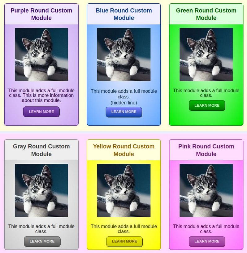
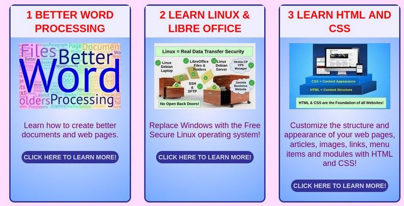
In this article, we will explain how we created our 24 Rainbow Module Presets. The Rainbow Module Presets include 12 vertical module layouts – intended to be used with 3 boxes per row - and 12 side by side module layouts intended to be used one or two boxes per row. Here is an example of our Rainbow vertical layouts:
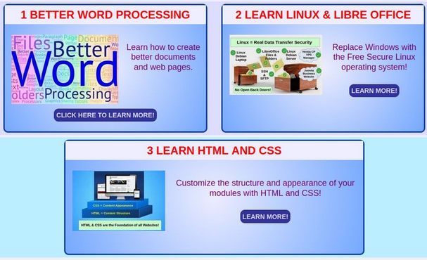
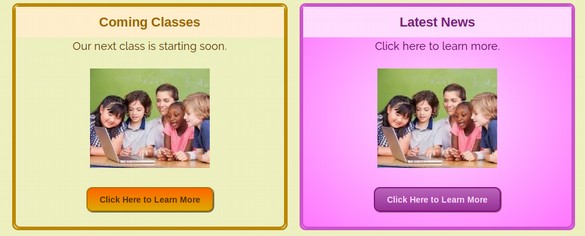
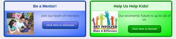
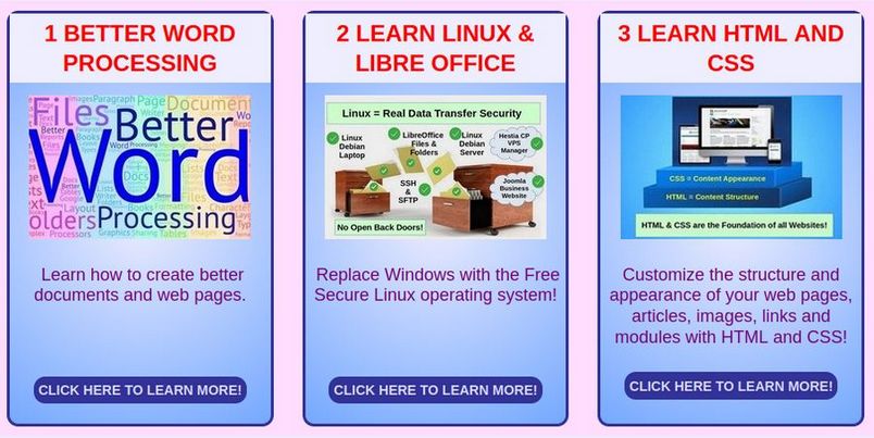
Here is an example of our side by side module layout:
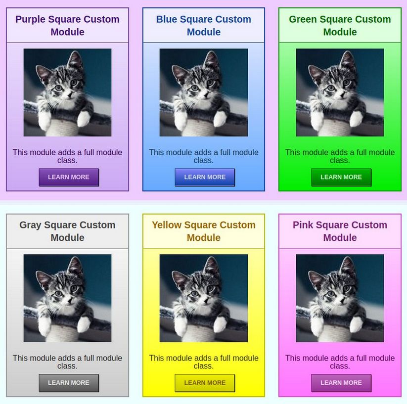
Both the vertical and side by side layouts come in 6 different colors with round buttons and 6 colors with square buttons.
In this article, we will review how we created these 24 CSS Presets, how to use them and how you can customize them even further.
How to Create Your Own Custom READ MORE Buttons
The easiest way to create your own buttons is to go online to a button CSS generator. Here is a link to a very easy one:
http://www.cssportal.com/css3-button-generator/
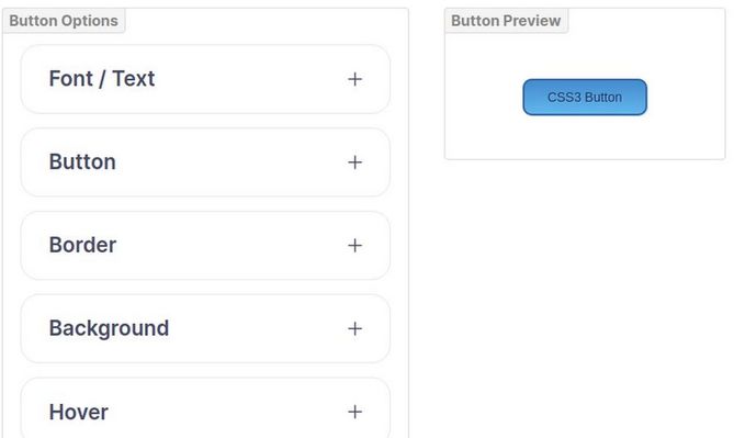
Here is the default screen for this button generator
The above Demo button uses a gradient background that changes color when we hover over it. To keep things simple, we will use a plain dark background that does not change color when we hover over it. Designing a button is like designing a miniature version of an entire module. We need to specify several properties. We will create 6 different buttons to match our 6 Rainbow module classes. We will also reverse the colors to make our button more distinctive. In other words, we will use light colored text on a dark background.
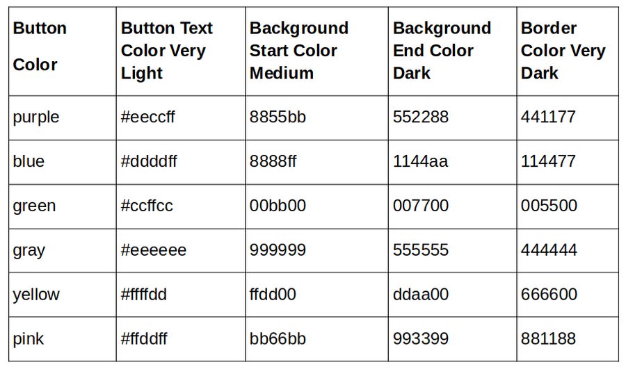
Below is a table of values for our 6 Rainbow button color settings. The only difference between the 16 round and 6 square buttons is that the round buttons have a border radius of 6 pixels and the square buttons have a border radius of 0 pixels.
Here are what our 6 light and 6 medium color options look like:
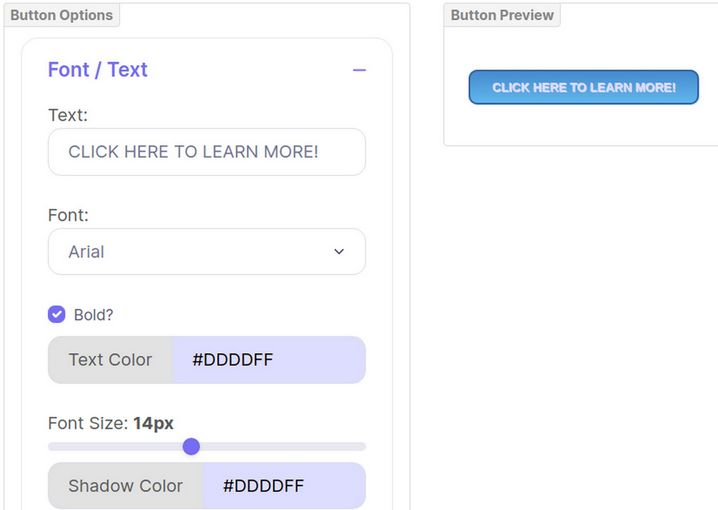
We will use CLICK HERE TO LEARN MORE! for our text. We will make each button bold Arial and a light color from the table above. Leave the font size at 14px. Make the Shadow color the same as the text color to make it more readable.
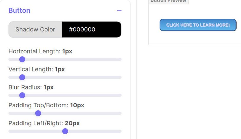
Then click on the Button tab. The Shadow color sets the border shadow. Set all Border Shadows to black with a thickness of 1 pixel but change the border color as shown in the table above. Leave the padding at 10 top and bottom. Reduce it from 25 to 20 left and right.
Then click on the Border tab. We will leave this at Solid and the radius at 10. Next click on the Background tab. Use a lighter color for the background and the same light color at the start and a darker color to finish. This is the blue button.

Click on the Hover tab. Change the hover text color to #ddddee to match the normal text color. Then reverse the gradient colors on hover. Type in the colors. Then copy the code to a button code document on your home computer.
Button color CSS
When copying, replace the .testbutton class with .buttonroundblue class and replace the “test button hover” with “buttonroundblue hover.” Here is the button code for our round blue button. There are two CSS selectors, one for the link and the other for hover:
.buttonroundblue a {
display: inline-block;
line-height: 1.3;
text-align: center;
vertical-align: middle;
margin-bottom: 20px;
font-family: arial;
font-weight: bold;
color: #DDDDFF !important;
font-size: 14px;
box-shadow: 1px 1px 1px #000000;
padding: 10px 20px;
border-radius: 10px;
border: 2px solid #114477;
background: #8888ff;
background: linear-gradient(top, #8888FF, #1144AA);}
.buttonroundblue a:hover {
display: inline-block;
line-height: 1.3;
text-align: center;
vertical-align: middle;
margin-bottom: 20px;
color: #DDDDEE !important;
background: #1144AA;
background: linear-gradient(top, #1144AA, #8888FF);}
Combine Button CSS with the previous module CSS
Now that we have all of our individual CSS classes, it is time to put them altogether. We will start with a simple module that does not use a gradient color either for the module background or the button background. Here is the code for our simpleroundbluemodule:
.simpleroundblue {
font-family: arial, helvetica, sans-serif;
margin: 0;
display: block;
min-height: 250px;
background-color:#ccccff !important;
/* MODULE BORDER ROUND STYLE */
border-radius: 10px;
border: 2px solid #1144AA;}
.simpleroundblue h3 {
/* MODULE HEADER STYLE */
text-align: center;
font-size: 22px;
color: #114499;
font-weight: bold;
line-height: 1.3;
padding: 10px;
background-color: #eeeeff;}
.simpleroundblue p {
/* MODULE DESCRIPTION STYLE */
text-align: center;
color: #113355;
font-size: 18px;
font-weight: normal;
line-height: 1.2;
padding: 5px;}
.simpleroundblue a {
/* BUTTON ROUND STYLE */
display: inline-block;
line-height: 1.3;
text-align: center;
vertical-align: middle;
margin-bottom: 20px;
font-family: arial;
font-weight: bold;
color: #DDDDEE !important;
font-size: 14px;
box-shadow: 1px 1px 1px #000000;
padding: 10px 20px;
border-radius: 10px;
border: 2px solid #114477;
background-color: #8888ff;
.simpleroundblue a:hover {
/* BUTTON ROUND HOVER STYLE */
display: inline-block;
line-height: 1.3;
text-align: center;
vertical-align: middle;
margin-bottom: 20px;
color: #DDDDEE !important;
background-color: #1144AA;}
Note that we have only one class above that needs to be added to our module Advanced tab. It is called simpleroundblue. The first section styles the entire module. The second section styles the h3 header box. The third section styles the “p” text box. Then the final two sections or selectors style the button.
Full Round Class 6 color options
Here is a more complex version of the above module with a radial gradient color for the module background and a different gradient color for the button and button hover.
.fullroundblue {
font-family: arial, helvetica, sans-serif;
margin: 0;
display: block;
min-height: 250px;
/* RADIAL BACKGROUND STYLE */
background-image: radial-gradient(ellipse farthest-corner at center, #DDDDFF 0%, #3366FF 100%);
/* MODULE BORDER ROUND STYLE */
border-radius: 10px;
border: 3px solid #1144AA;}
.fullroundblue h3 {
/* MODULE HEADER STYLE */
text-align: center;
font-size: 22px;
color: #114499;
font-weight: bold;
line-height: 1.3;
padding: 10px;
background-color: #eeeeff;}
.fullroundblue p {
/* MODULE DESCRIPTION STYLE */
text-align: center;
color: #113355;
font-size: 18px;
font-weight: normal;
line-height: 1.2;
padding: 5px;}
.fullroundblue a {
/* BUTTON ROUND STYLE */
display: inline-block;
line-height: 1.3;
text-align: center;
vertical-align: middle;
margin-bottom: 20px;
font-family: arial;
font-weight: bold;
color: #DDDDEE !important;
font-size: 14px;
box-shadow: 1px 1px 1px #000000;
padding: 10px 20px;
border-radius: 10px;
border: 2px solid #114477;
background: #8888ff;
background: linear-gradient(top, #8888FF, #1144AA);}
.fullroundblue a:hover {
/* BUTTON ROUND HOVER STYLE */
display: inline-block;
line-height: 1.3;
text-align: center;
vertical-align: middle;
margin-bottom: 20px;
color: #DDDDEE !important;
background: #1144AA;
background: linear-gradient(top, #1144AA, #8888FF);}
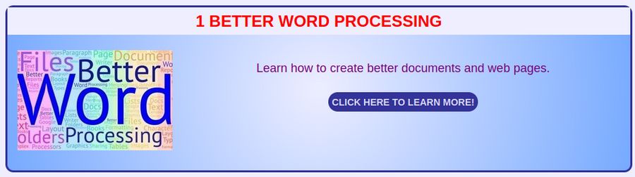
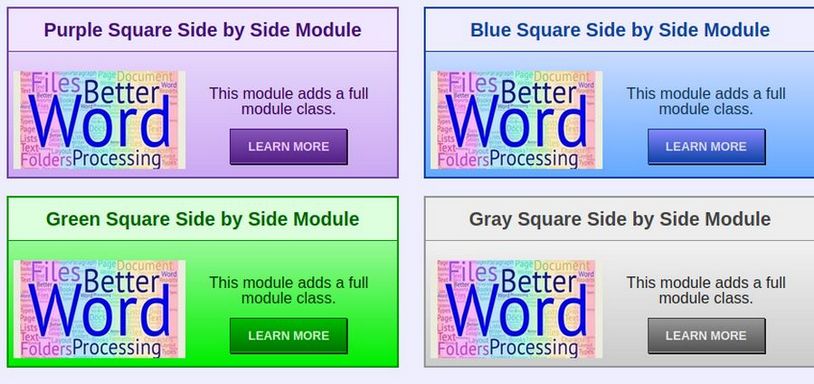
Assuming you have added the Rainbow CSS Presets to your Helix template custom.css file, all you need to do to apply this style to a module is type “fullroundblue” into the Module Advanced Tab Module Class box. After finishing all 6 full round and all 6 full square module styles, then creating one module to show each style, here is what our 6 finished round modules look like:
How to Change the Module Layout from Vertical to Side by Side
One concern about traditional stacked modules is that they take up more vertical space on the screen than needed.
The large amount of vertical space is due to the fact that all of the elements of each module are vertically stacked from the Heading on top to the description, image and button on the bottom. This vertical stacking creates problems for viewing modules on mobile devices as it requires more scrolling. Therefore, we will review how to change the orientation of the module elements so that the description and button are placed to the right of the image. There should be no more than two of these modules per row.
If using one Module per row Change the Module Image Order and Alignment
This change must be made directly in each module using the JCE editor. Go to Content, Site Modules and create duplicates of three vertical modules. Open the first duplicate and change its name by adding Side By Side to the end. Change the module position to bottom1a and publish it. Then if the image was below the description, cut and paste the description to put it below the image. . Next, select the image and change the image float from the default of align center to align left. Also add 10px of margin all around the image. Click Update. Here is what the workspace now looks like:
Click Save and Close and View the result:
If using two Modules per row, Change the Module Image Order Alignment and Size
Open the second duplicate and change its name by adding Side By Side to the end. Change the module position to bottom1b and publish it. Then if the image was below the description, cut and paste the description to put it below the image. Next, select the image and change the image float from the default of align center to align left. Also add 10px of margin all around the image. Also reduce the width of the image from 250px to 200px.
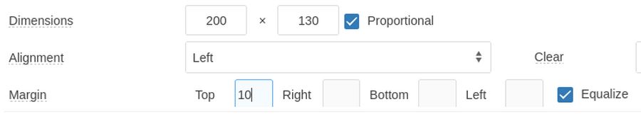
Also reduce the button to LEARN MORE. Click Update. Repeat for the third duplicate module putting it in bottom1c. The view the result:
How to Insure Feature Boxes Have Equal Heights
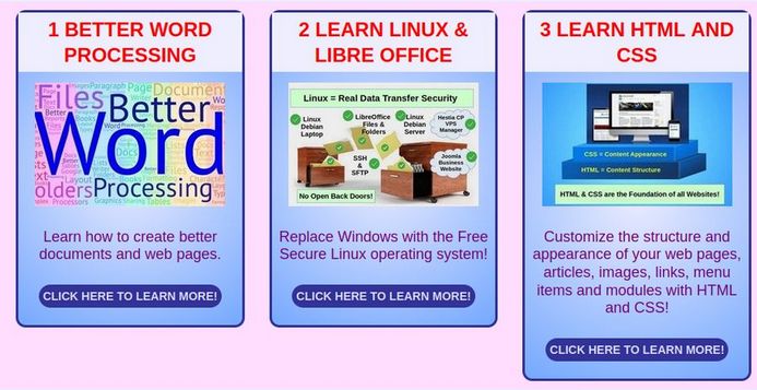
Our feature box modules now look pretty nice. But if some of our module titles or descriptions are much longer than the other titles and descriptions, some modules will be taller than others:
The Helix Template uses a CSS property called Flexbox to control the appearance of modules in rows. Using Flexbox should result in all modules being the height of the tallest module. The reason it does not is because Helix adds several hidden selectors to the HTML chain. Open the page with the Libre Wolf browser and click Tools, Browser Tools, Web Developer Tools. Then click Pick an element to select the HTML element, which in this case is called <section id=’sp-top-row-3’>. Click on the right facing arrows in the HTML column several times to expand the HTML chain:
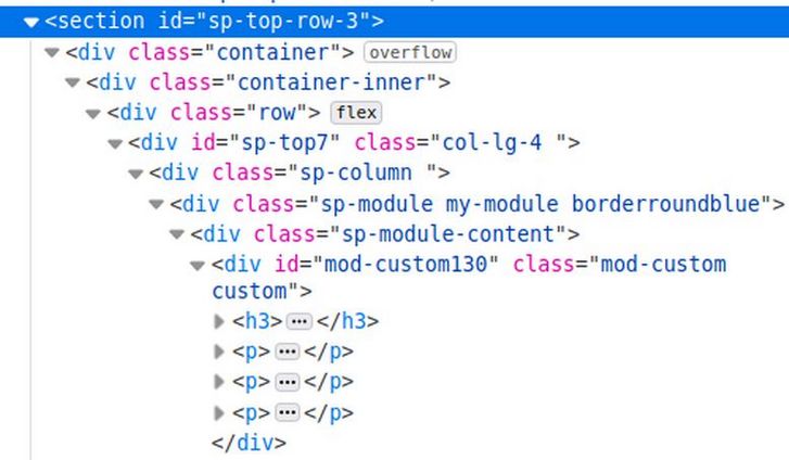
Note that one of the divide elements has a class called “row”. To the right of this class is the word flex. This is where the Helix template applies the flex property. However, this property only makes the heights equal for the child of the row divide – which is a divide with the class sp-middle3a. There is an identical chain for sp-middle3b and sp-middle3c. So these three modules should have the same height. However, the additional divides below this prevent the module heights from being equal. The solution to this problem is to add the flex property to two more elements in the HTML chain. Here is what we need to add to the Helix Custom Code CSS box:
.sp-column {display: flex; height: 100%; justify-content: space-evenly;}
.sp-module {display: flex; flex-direction: column; height: 100%; }
Then click Save and Close and view the result:
There is a problem with the sp-module class as adding the flex property to all modules causes some modules such as the mobile menu and mega menu to not display properly. We therefore need to delete the general sp-module css class and specifically target our rainbow module classes with the following CSS added to our custom.css file:
.sp-module.fullroundpurple {
display: flex; flex-direction: column; height: 100%; }
.sp-module.fullroundblue {
display: flex; flex-direction: column; height: 100%; }
.sp-module.fullroundgreen {
display: flex; flex-direction: column; height: 100%; }
.sp-module.fullroundgray {
display: flex; flex-direction: column; height: 100%; }
.sp-module.fullroundyellow {
display: flex; flex-direction: column; height: 100%; }
.sp-module.fullroundpink {
display: flex; flex-direction: column; height: 100%; }
.sp-module.fullsquarepurple {
display: flex; flex-direction: column; height: 100%; }
.sp-module.fullsquareblue {
display: flex; flex-direction: column; height: 100%; }
.sp-module.fullrsquaregreen {
display: flex; flex-direction: column; height: 100%; }
.sp-module.fullsquaregray {
display: flex; flex-direction: column; height: 100%; }
.sp-module.fullsquareyellow {
display: flex; flex-direction: column; height: 100%; }
.sp-module.fullsquarepink {
display: flex; flex-direction: column; height: 100%; }
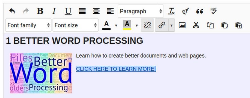
We can add 2 hidden lines to the HTML of the two module with less content to push the READ MORE link to the bottom of the module:
We also need to add the following CSS to our custom.css file:
.container { padding-top: 10px; padding-right: 10px; padding-bottom: 10px; padding-left: 10px;}
.col-lg-6 {flex: 1 1 auto;}
.sp-module {flex: 1 1 auto;}
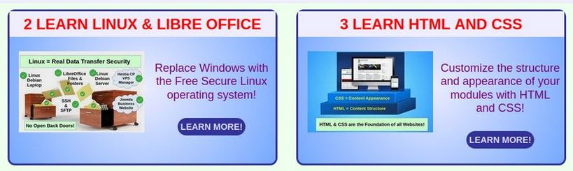
Here is an example of our side by side Rainbow modules:
Summary
To add our Rainbow Module Presets to your website, rather than attempting to add all this code to your CSS file, all you need to do is:
First, download our zipped Rainbow Module Presets file from our website:
https://createasecurewebsite.com/free-downloads
Second, go to Templates, Code and click on the Helix template to edit it. Then create your own custom.css file.
Third, unzip the Rainbow Module Presets file and open the custom.css file. Then copy paste the contents into your own custom.css file.
Fourth, open the templateDetails dot xml file and add the 33 module positions as we demonstrated earlier in section 7.1 of this chapter. (note that a PDF file of Chapter 7 is included in the zipped Rainbow Module Presets file). This xml file will be overridden during a Helix update. However, Helix should soon add the ability to create Child templates. Once this feature is available, we can create a child template, change the xml file in the child template and then use the child template to display the pages of our website.
Fifth, go to Templates, Styles and click on the Helix template to edit it. Then click Layout and add the three top rows and 9 top module positions. Then add the four middle rows and 12 middle module positions. Then add the six bottom rows and 12 bottom module positions (all as explained in Section 7.1).
Sixth, create your own feature box images.
Seventh, go to Content, Site Modules, New and select the custom module. Then click ADD. Name the module whatever you want and add the heading 3 text, the feature image, the description text and the READ MORE line and link.
Assign the module to one of our custom module positions, for example, middle1a.
Then click on the Advanced tab and in the module class box, type a space, then type the rainbow module class you want to use, for example, fullroundblue.
Then click Save and Close and view the result.
Congratulations! You can now make as many custom Rainbow modules as you want!
What’s Next?
This concludes our chapter on making custom modules. In the next chapter, we will add a slideshow and videos to our Home page.