
Feature boxes are boxes shown on the Home page of your website with a title, a short description, a link to a full web page (and optionally an image). Here is an example of a row of feature boxes.
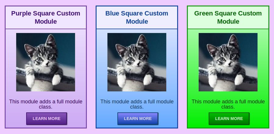
Feature boxes are used to direct your website visitors to special pages on your website. Feature boxes can be placed above or below the main content area of your Home page. There are often two to four feature boxes on a row with typically one to two rows above the main content area and two or more rows of boxes below the main content.
One glaring problem of the Helix template (and Joomla in general) is the difficulty of controlling the appearance of feature boxes (which Joomla calls “modules” and Bootstrap refers to as “cards”). There are a couple of “extensions” and “content construction kits” which attempt to solve this problem. But they simply add another layer of complexity and another set of CSS classes that can make controlling the appearance of your feature boxes even more difficult. Therefore, we will first review the native way that Joomla handles feature box content and appearance. We will then add a simple series of custom CSS classes that can help you quickly and easily control the appearance of your feature boxes.
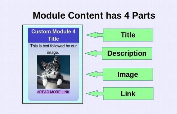
Each Module has 4 Parts for Content and 4 Parts for Styling
All websites consist of content – such as text, images and videos - and the style applied to this content – such as whether you use black font or red font. The same is true of modules. The module has content and styling to determine its appearance. The content of a module typically has four main parts. These are a Title, a Description, an Image (or video) and a READ MORE link leading to a more complete page describing the topic or product.
The style of appearance of a module also has four parts:
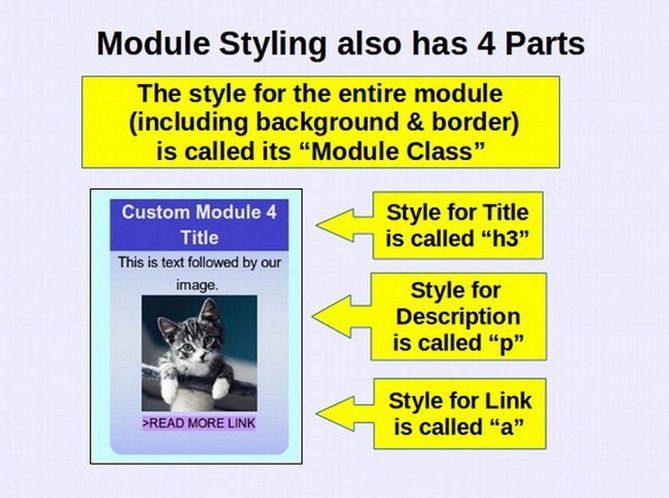
Controlling the style of our module means controlling the appearance of the Title Box, the Description area, the READ MORE link and the background color and border of the module. To take full advantage of this system, we need to learn how to create the content for and style the appearance of these modules. We will first explain how to create a simple custom module using HTML and then review how to control the appearance of this module using CSS.
While you do not need to know either HTML or CSS to create modules, it is helpful to understand these concepts to better understand how any given module is structured and styled. If you really do not want to learn about HTML and CSS, you can skip this section and move directly to Section 7.4 where we explain how to control the content and appearance of modules just by using our Rainbow Module Presets.
What are HTML and CSS?
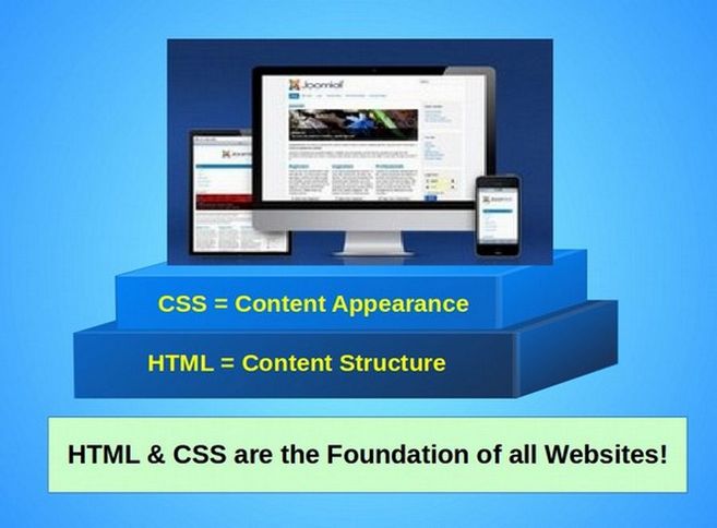
HTML stands for Hyper Text Markup Language and CSS stands for Cascade Style Sheets. HTML controls the structure of web content, in other words, what order the content appears on the web page. CSS controls the appearance of web content, in other words, how our content looks on the web page. Together, these two website building languages are the foundation of every website in the world.
I want to make it clear that this brief explanation of HTML and CSS will not be a real course on either HTML or CSS. We will simply be using a couple of very basic commands in order to better understand how to make and style Joomla Custom Modules. Here is a link to our course on HTML and CSS: https://learnhtmlandcss.com/
Let’s see how Joomla and Helix create modules or feature boxes.
Step 1 Use Helix to Create New Rows for Feature Boxes
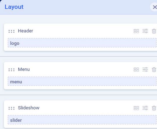
One of the biggest benefits of the Helix template is its Layout tool which allows us to easily add more rows and more module positions to our Layout. Go to Templates, Styles and click on the Helix template to edit it. Then click Template Options, Layout. We have previously created rows for our header, main menu and slideshow:
Here are what these three rows look like in the front end:
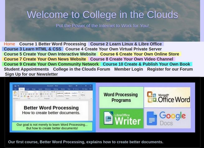
We have given the Header row a background color of medium blue, the Menu row a background color of light blue and the slider row a background color of black.
Plan your module positions
If you have a small website with little content, you might not need to add any more module positions. But if you have a business with dozens of products and services, you should add at least three rows for up to 9 custom modules (two or three per row) above the main content area and at least 6 rows for up to 18 custom modules (two or three per row) below the main content area. In our case, we will need enough module positions to demonstrate our Rainbow Module Presets which include 12 vertically stacked modules (6 round colors and 6 square colors) as well as 12 side by side modules (6 round and 6 square). Thus, we need 24 additional module positions. To keep these all together, we want to put all 24 modules below the main content area.
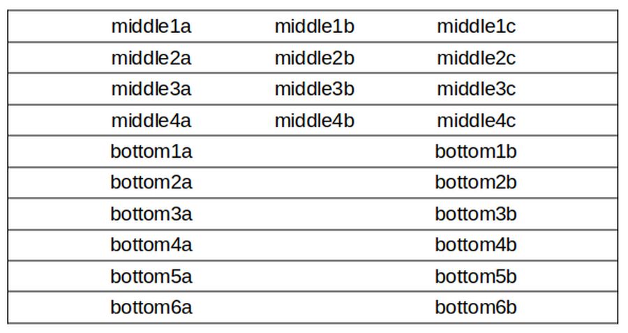
The vertically stacked modules can be three to a row but the side by side modules should be two to a row. Thus, we will need four rows for our 12 vertically stacked modules. We will call these Middle Row 1 through 4. We will also need 6 rows for our side by side modules. We will call these Bottom Row 1 through 6. The three columns for the four middle rows will be a, b and c. For example, the module positions for Middle Row 1 will be middle1a, middle1b and middle1c. The two columns for the 6 bottom rows will be a and b. For example, the module positions for Bottom Row 1 will be bottom1a and bottom1b.
In addition, we will create three more rows of module positions above the main content area. We will call these Top Row 1 through 3. Each will be three columns with three module positions. For example, top1a, top1b and top1c. Here is a table of our 9 new module positions above the main content area:
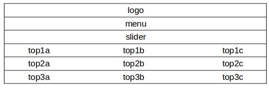
Here is a table of our 24 new module positions below the main content area:
Add New Module Positions
Now that we have a plan of how many module positions we need to create, we can start making our new module positions. There are two ways to add new module positions. We will first describe how to add module positions one at a time. Later, we will show you how to add several module positions all at the same time.
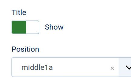
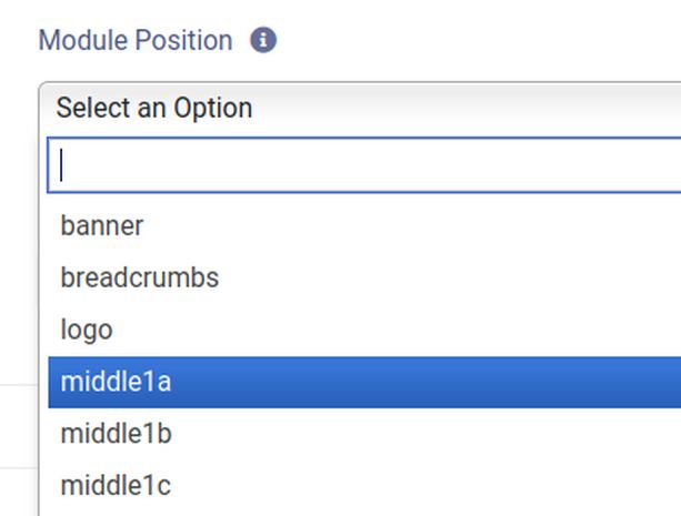
To add new module positions one at a time, add a custom module by going to Content, Site Modules. Then click New and click the plus sign to the right of the Custom Module. For Title, call it Module Position Middle 1a. For description, copy and paste: We will use this module to add a new module position. Leave the status as Published. Then in the Position box, click on the word None to bring up this box:
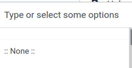
Instead of using the drop down arrow to choose an existing module, type in the word middle1. Select the word middle1a and press Enter.
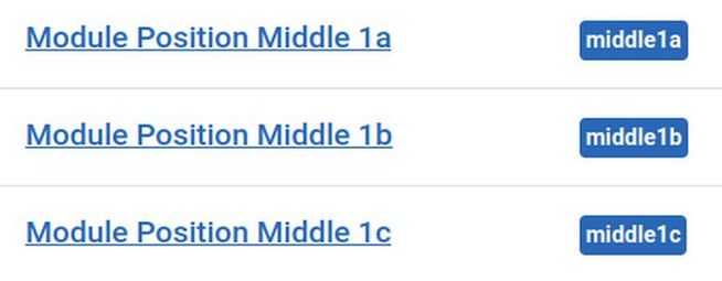
Then click Save. Verify that the new module position was accepted. Then click Save and Close. Then select the module and in Actions, click Duplicate. Select it again and click Duplicate again. Then open the first duplicate module. Change its name to Module Position Middle 1b. Use the small x to delete the word middle1a and type middle1b. Select it and press Enter. Then click Save and Close. Repeat to add the third module using the middle1c module position. Here is what our module table now looks like:
Next go to Templates, Styles and click on the Helix template to edit it. Click Layout. Then below the Main Body, click the plus sign to add a new row. Call it Middle Row 1.
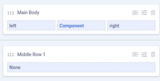
Click on the four small boxes to open the column selector and click 4, 4, 4 to add three columns to this row. Click on the three hidden dots to the right of the word None to open the Column Options. Then for Module Position, click the arrow to the right of Select an Option and choose middle1a. Click Apply.
Repeat to add middle1b and middle1c to the other two columns. Then click Save and Close and View the front end of your website:
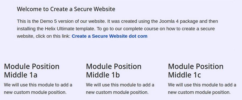
There are now three content boxes just below the main content area which has your Welcome article. Adding module positions one at a time is OK for adding just a few module positions to your website layout. But if you are building a business website and looking forward to a future will you will offer lots of products and or services, then it is easier to add lots of module positions all at the same time.
Add Many Module Positions
To add several module positions all at the same time, go to Template, Code and click on on the file templateDetails.xml to edit it. The module positions start at line 26 with:
<positions>
<position>title</position>
<position>top1</position>
<position>top2</position>
<position>top3</position>
Delete the top1, top2 and top3 module positions and replace them by copying and pasting the following 9 module positions:
<position>top1a</position>
<position>top1b</position>
<position>top1c</position>
<position>top2a</position>
<position>top2b</position>
<position>top2c</position>
<position>top3a</position>
<position>top3b</position>
<position>top3c</position>
Then scroll down and between the slide position and user1 position, create a new line. Copy paste the following 12 module positions at this new line:
<position>middle1a</position>
<position>middle1b</position>
<position>middle1c</position>
<position>middle2a</position>
<position>middle2b</position>
<position>middle2c</position>
<position>middle3a</position>
<position>middle3b</position>
<position>middle3c</position>
<position>middle4a</position>
<position>middle4b</position>
<position>middle4c</position>
Just below these new middle module positions, enter a new line. Then copy paste these 12 module positions:
<position>bottom1a</position>
<position>bottom1b</position>
<position>bottom2a</position>
<position>bottom2b</position>
<position>bottom3a</position>
<position>bottom3b</position>
<position>bottom4a</position>
<position>bottom4b</position>
<position>bottom5a</position>
<position>bottom5b</position>
<position>bottom6a</position>
<position>bottom6b</position>
Then click Save and Close. Then click Close.
Note: These changes to the template.Details.xml file will be lost whenever there is an update to the Helix template. You will need to open the xml file and copy paste the changes back in again. Alternately, Helix should soon add the ability to create Child Templates (a feature Joomla introduced with version 4.1 in February 2022). Once Helix has added this feature, we will be able to first create a Helix child template. Then make the changes in the child template xml file (which will not be affected by updates to the parent template. Then use the child template as our website template.
Add New Rows, Columns and Module Positions using the Helix Layout Tool
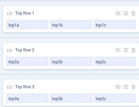
Click Template, Styles and click on the Helix template to edit it. Click Layout and add Top Row 1 Top Row 2 and Top Row 3. Make each three columns. Then click on each column in Top Row 1 and add the new module positions top1a, top1b and top1c. Repeat to add three module positions to Row 2 and Row 3. Here is the result:
Below the main content area, add Middle Rows 1 through 4 and Bottom Rows 1 through 6. Then add columns to these rows and module positions to each column. To practice displaying different feature boxes in different rows, give each row a different background color. Click Save and Close.
Step 3 Create a Module Demo Page
In order to see how our custom modules will appear on our website, create a new article called Module Demo Page. Go to Content, Articles New. For Title, type in Module Demo Page. For description, type: “This is our page to view new modules we will be creating.” Leave the article unassigned to any category and not on the Home Page. Click Save and Close. Then create a single article menu item for our Module Demo Page in our Main Menu. Click Save and Close.
Step 3 Create your First Feature Box
Now that we have module positions and a page to assign our new practice modules to, we are ready to create our first feature box. Go to Content, Site Modules, New. This will bring up a page called Select a Module Type. This page has a list of many module types. Scroll down the page and click Custom. This takes us to the Joomla Modules: Custom screen which looks like the Article Edit screen.
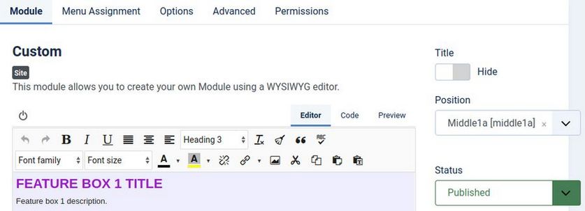
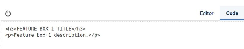
To simplify the module creation process, we will focus on only the title and description. Once we have mastered controlling the appearance of the title and description, we will review adding the image and READ MORE link. For Title, type Module 1. For Show Title, change it to Hide. For Position, choose Helix middle1a. Then in the JCE Editor workspace, type or copy paste these two lines:
FEATURE BOX 1 TITLE
Feature box 1 description.
Then select the title line and change format to Heading 3. Here is what the workspace will now look like:
HTML uses elements and brackets
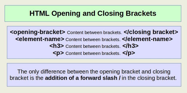
There are two HTML elements in the above feature box. The Title uses the h3 (or heading 3) element and the description uses the p (or paragraph) element. To see the HTML for these two elements, click on the Code tab:
Note that both the heading 3 and paragraph elements have an opening and closing bracket around the actual text which is placed between the brackets like this:
Then click on the Menu Assignment tab and change it from On All Pages to Only on the pages selected. Then click None. Then click on the Module Demo page. Then click Save and Close and view the result in the front end of your website:
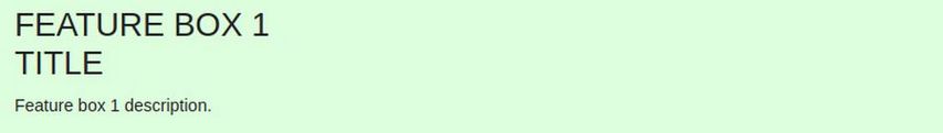
When no CSS has been added to the module, its appearance is controlled by the default CSS settings in your web browser.
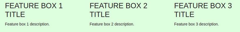
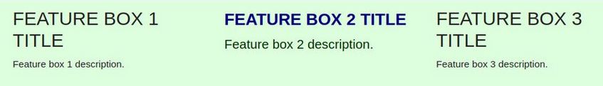
The web browser default CSS settings are pretty ugly. It is therefore important to add our own custom CSS to each of our feature boxes. To see the difference that adding CSS can make to a feature box, we will add two more feature boxes and add our CSS to these – but leave our first module unstyled so we can see the difference that our custom CSS makes. To add two more feature boxes, go back to Content, Modules and select your first feature box. Then click Duplicate. Then select and click Duplicate again. Then change the name of the second module to Module 2 and change the position to middle1b and publish it. Then change the title to FEATURE BOX 2 TITLE. Then click Save and Close and repeat these steps for Module 3 in position middle1c. Then view the result:
Three Ways to Add CSS to a Module
There are three ways to add custom CSS to a module. These are Inline CSS, Internal CSS and External CSS:
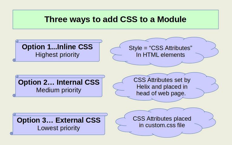
In this article, we will use Inline CSS to add styles directly to the Heading 3 and Paragraph elements. Then in the next article, we will use Internal and External CSS to make the same changes to our Heading 3 and Paragraph elements.
Option 1 Inline CSS… Applying the Style Attribute to Elements
Inline CSS applies the style attribute to customize our headings and paragraphs. Whenever you select an element and make a change to it using the JCE editor, the JCE editor will apply the style attribute to the content you selected.
Use the JCE Editor to set the Module Title Style
In order to change the appearance of content with the JCE Editor, go to Components, JCE, Global Configuration and change Validate HTML from Yes to No. Then click Profiles and click the Plugin Parameters tab. Then click Clipboard and change Remove all Styles from Yes to No. Then click Save and Close.
Then go to Content, Modules and click on Module 2 to edit it. Change its title to My Second Custom Module in the Work Space just above the description. Select the title and use the JCE editor to make it 18 pt, bold and dark blue #333399).
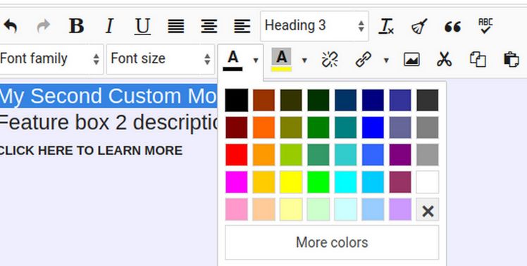
Then select the description and change the font size to 14pt and dark green. Then click Save. Here is what the workspace now looks like:
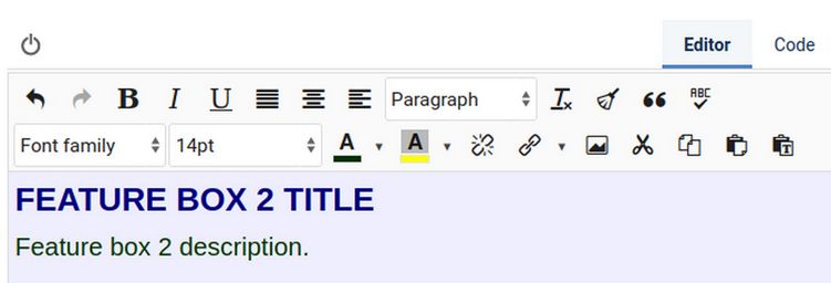
Then click on the Code tab to see the changes made to the HTML code. Here is the HTML with the h3 element in bold:
<h3><strong><span style="font-size: 18pt; color: #000080;">My Second Custom Module</span></strong></h3>
<p><span style="font-size: 14pt; color: #003300;">Feature box 2 description.</span></p>
Inline styles uses <element style=”property: value; property: value;”>
The JCE editor put the inline CSS in a span tag:
<span style="font-size: 18pt; color: #000080;">
However, it could have also put the Inline CSS directly in the h3 tag like this to have the same result:
<h3 style="font-size: 18pt; color: #000080;">
Each Inline CSS Style Attribute Rule has four main parts
The first part is an html element opening bracket such as <h3 followed by a STYLE EQUALS function. The second part is one or more properties with one or more values placed inside of quotation marks and separated by colons and semi-colons. The third part is the content or words that the style is being applied to. The fourth part is the element closing bracket. Here is a graphic of Inline CSS:
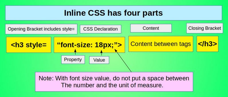
Here is the generic format of inline CSS using the style attribute:
<html element style=”Property:Value; Property:Value;”><This is the text being modified by the inline CSS></element closing tag>
Note that the style equals function is placed inside of the html opening bracket arrows: <h3 style=”property:value;”>
Now that we understand the inline CSS added by the JCE editor, click Save and Close and View Site.
Drawbacks and Advantages of Inline CSS
There are several problems with the Inline CSS method of creating custom modules. First, it requires knowing at least some HTML and CSS. Even one small mistake may prevent the module content or styling from displaying properly. Second, each module will need to be styled one at a time – a very time consuming task if you have a lot of modules to make. But the biggest problem is trying to remember what hexadecimal color combinations go with what modules. This is why most courses on HTML and CSS will tell you to NOT use the style attribute to customize the appearance of your text. Instead, they will tell you that you should ALWAYS use an External CSS Style sheet.
However, using the style attribute to define the appearance of a particular element, such as a particular heading or a particular paragraph, can be useful when you want an element to appear differently from the other headings and paragraphs around it. You can even use the <span> element combined with the style attribute to make any section of a paragraph or sentence appear different from the rest of the paragraph or sentence. The reason this is possible is that the Style Attribute has priority over whatever appearance settings are placed in a CSS style sheet. Inline Style attributes will also over-ride the default style settings in your web browser. Thus, style settings give you full control over the appearance of the content on your website – even if for some reason you are working on a web page that has a dozen different style sheets applied to it and you do not have access to any of these style sheets.
What’s Next?
In the next article, we explain how to use Internal and External CSS.